The story makes the brand.


The Still House
Name development
Branding
Logo design
Product branding
The Story
The Still House at Gervasi Vineyard is a distillery, cafe by day and cocktail lounge by night. The name was derived from the distillery and the stills used in the spirit making process and also incorporates the Sinners and Saints church theme used throughout. There’s a unique and fun juxtaposition of the “quiet” and “stillness” of a church and the “spirits” and “discord” of a distillery that we got to play with.
There was a church in Italy that was part of the Gervasi family history and I used that to incorporate into the branding. The spire in the logo design was modeled from that church so we added a spire to the top of the building, integrated it into the label designs on the spirit bottles (shown in my print section) and used it throughout the decor.


Decker Golf
Branding
Logo design
The Story
Jon Decker is a Golf Tips Magazine top 25 instructor, author, public speaker and professional golf instructor. Jon had a vision for this new brand and I was able to bring that to life. I created the silhouette from a photo of his actual golf swing and used the DG as an additional identifier for apparel, golf balls and other golf swag. The color palette and concept have a strong athletic brand feel to them.


The Twisted Olive
Name development
Branding
Logo design
Concept design
The Story
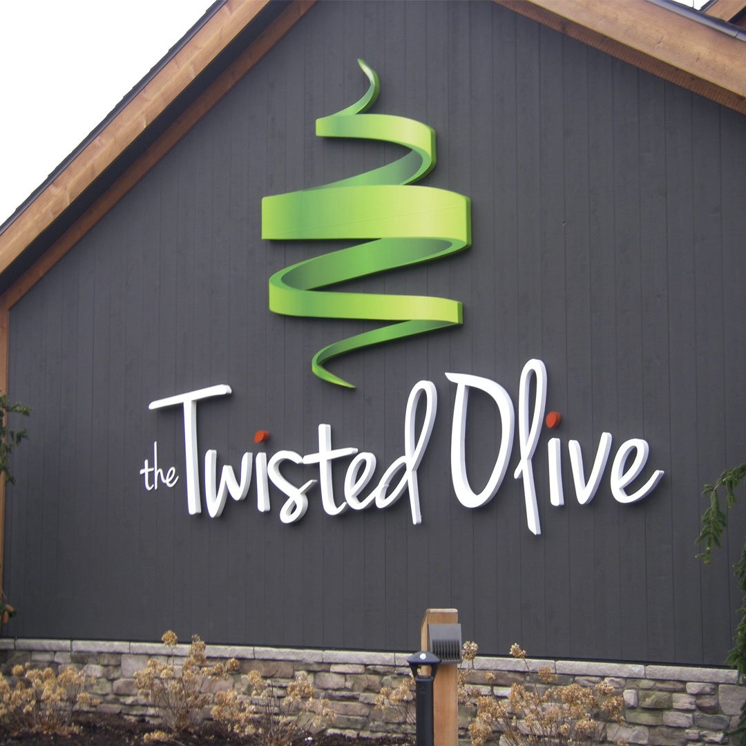
The first obstacle in this branding project was selling the owners on the name “The Twisted Olive”. In the initial discussions we knew that the Italian-American Kitchen would incorporate different takes on olives from the food and drink menus down to the interior design. After building a strategy and concept designs the brand came to life and was an easy decision for the client.
We played around with ideas like “Get It Twisted”, “Let’s Get Twisted” and “A Modern Twist on Classic Italian” for marketing, drink menus and apparel for the merchandise store.
Power Distributors
Rebranding
Logo design
Identity system
Product branding
The Story
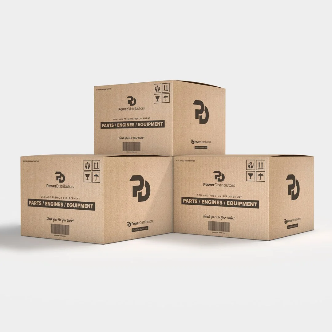
I led the company rebranding strategy for Power Distributors, a supply chain management company headquartered in Columbus, Ohio. We took the “PD” used to reference the company and added design elements to represent movement in the “P” and connection with it overlapping the “D”.
I presented four concepts (shown in the mood boards above) that touched on each of the unique values the company offers; connecting to the customer, logistics, technology and supply chain solutions. Ultimately we landed on the “Connection” concept to create a deeper synergy with the customer-base using the logo from the logistics board.


Kinetix
Name development
Branding
Logo design
Product branding
The Story
Kinetix started as a line of engine oils for outdoor power equipment that has quickly grown into a multi-million dollar brand of performance products. The name came from an idea around the friction and kinetic energy created inside of an engine or by a piece of equipment. You can see how the “n” and the “e” in logo are somewhat grinding together and the drop in the “e” represents lubrication on that point.
Product branding includes multiple lines of engine oils, canned fuel, lubricants, latex gloves and fuel treatments. The name has become popular in outdoor power equipment industry.


Bloom
Rebranding
Logo design
UI concept design
The Story
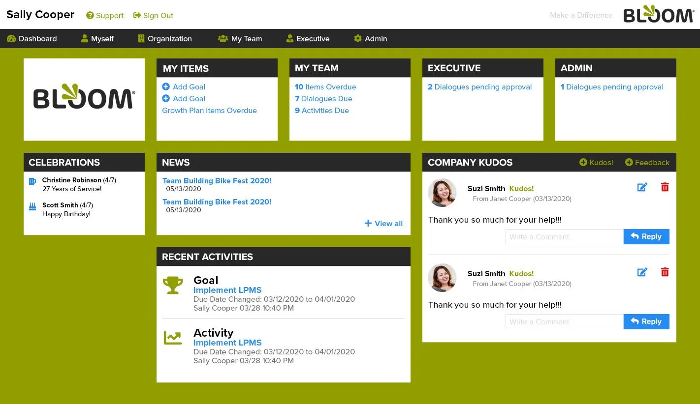
The Bloom Leadership Platform was rebranded to make the product more relevant with today’s workplace. Providing a platform for leaders and teams to engage within the workplace and remotely, this web-based software needed a brand that connects with it’s target audience. The modern font choice and color palette speak to what the platform ultimately achieves and that’s growth. The tagline “Be a Leader. Not a Boss.” empowers leaders to do more than just give orders and be an inspiration so teams can “Bloom”.


Gervasi Vineyard
Branding
Product branding
The Story
I’ve been fortunate enough to work closely with Gervasi Vineyard for several years and was able to watch the winery and restaurant grow significantly over the years. The overall strategy for Gervasi was to create a best-in-class brand with print collateral and a digital presence to show that. We were involved in creating vehicle wraps, over 30 pieces of print marketing, website design, package design, wine and beer labels and branding additional establishments located on the property. I’m working on adding more projects to what is shown above.


900 JCKSN
Branding
Logo design
The Story
The twelve-unit 900 JCKSN condominium development is located in the new River District neighborhood of Elkhart, Indiana featuring trails, river access, aquatics and fitness facilities. We knew the brand had to speak to the modern architecture and urban river lifestyle so the look needed to be modern, clean and sophisticated. The typography and simple colors achieve exactly that.


